    observeEvent(req(input$Position),ignoreInit = TRUE,{

      if (input$Position==2) {
        shinyjs::show("PrincipalDiv")
        shinyjs::show("SchoolUIDDiv")
        MySchoolPerformanceServer("Principals",
                                  data=reactive({Dat}),
                                  county=reactive({input$SchoolCounty}),
                                  uid=reactive({input$SchoolUID}))
      }

      else if (input$Position==1) {
        shinyjs::hide("PrincipalDiv")
        shinyjs::hide("SchoolUIDDiv")
      }

})The ‘Nuance Problem’ - How R Shiny Can Solve Dashboard’s Biggest Problem
R Shiny
Strategy
Shiny modules allow for more scalable customizations for reporting solutions
A big problem with dashboards is what I call the “nuance problem.”
Many organizations invest in dashboard solutions to automate the drudgery of manually compiled reports. This is usually the first solution that organizations will implement when they upgrade their analytics practice because they can see an immediate, tangible benefit.
However, report automation requires standardization. And standardization means focusing on the commonalities between stakeholders, which also implies ignoring the differences between those stakeholders.
I remembered this problem recently after speaking with a former colleague, who currently works at a marketing agency.
Like many organizations, her company had a “master dashboard” (for lack of a better term). This dashboard reported common metrics on the performance for the various accounts throughout the company.
However, her team still had to spend 30-40 hours a quarter preparing a presentation for her client.
Now, a little prep work is normal. You’ll always need some ad-hoc analysis for any stakeholder, but the prep work in this case included metrics that could be automated.
I asked her, why couldn’t this data be pulled from the dashboard?
“Well, some visualizations on the dashboard are useful,” she said, “but our client situation is different than the others in our company. Our client is really multiple clients, because they have multiple brands. The way their data needs to be presented is different than most of the other clients.”
In shorter terms, she was describing the “nuance problem.” Her reporting needs are somewhat different than what the standard reports shows. And so, her team still has to manually compile the reports.
These nuances are common across organizations. Despite the report automation, it’s the nuances that prevents report automation from benefiting stakeholders. Most will turn back to the reliable, if tedious, Excel workbooks they had previously relied upon.
There are a few ways to tackle the nuance problem.
A self-service model can go along way, if done correctly. So could more ad-hoc analysis services provided by the analytics team.
But a big culprit for the nuance problem is tool selection.
Most dashboard tools used at the enterprise level simply can’t accommodate nuance for large groups of stakeholders.
Except for one…
How R Shiny Can Solve the Nuance Problem
R Shiny is a web-development framework that uses R programming to build dashboards, although we typically use the term “application” instead of “dashboard.”
Because Shiny is written in code, we can create highly precise rules to dictate the application’s behavior. This allows the analyst to provide a much more robust solution to the problem described above.
More specifically, it’s the Shiny concept of “modules” that can accommodate these nuances.
Modules were built to make it easier for Shiny developers to re-use custom features across multiple Shiny apps or within the same application.
Because modules can be placed in a central location, Shiny developers can easily update, maintain, and improve the module, without having to worry about re-writing every line of code of applications that use it.
However, modules have another use case that applies to the “nuance problem.”
We can create custom data visualizations within modules that apply to a single stakeholder group. Those custom visualizations can then be displayed on the “master dashboard” whenever that stakeholder group opens it.
Since R Shiny allows for precision programming, we can trigger these modules to run when:
A user with special credentials or group assignments open the application
A highly specific filter option is clicked
Some other specific rule is written
Can’t Other Dashboard Tools Do This?
The short answer is… sort of. Other dashboard tools that don’t require as much programming can accomplish this functionality, but they seldom perform well in my experience.
They tend to run slower and slower as more complexity is added. The user-experience also becomes more “clunky.”
With these tools, ETL becomes more important to support the nuanced presentations. Either more data transformations are incorporated into the dashboard itself, which also decreases performance, or it’s built within the data architecture, which increases development time.
A more common practice though that many data teams adopt is simply duplicating the dashboard. They’ll make a copy, create separate visualizations for the requesting stakeholder, and publish them both.
That might seem sensible, but it creates far more administrative costs to maintain what should be a single report. Why is that?
Well, these duplicates have a set of common metrics that need to appear on all of them. If a metric’s definition needs to be updated on one, it has to be updated on another. Otherwise, stakeholders will start to see conflicting data when comparing the reports. Whenever they see conflicting data, the dashboard’s status as “the source of truth” diminishes.
As you can imagine, that takes a lot of time. And it’s one of the reasons data teams get stuck in the “reporting trap,” where their entire schedule is spent on the on-going maintenance and production of automated reports.
Shiny modules, on the other hand, allow for the compartmentalization of these nuanced requests. It doesn’t cause the report to slow down and it doesn’t require that we create unnecessary duplicates of the report. We simply create a self-contained “micro-application” called by the “master-application” when required.
Example
At Free State Analytics, we recently built the following Shiny application to demonstrate how modules can provide the “nuanced visualizations” described above.
This dashboard uses artificially generated data (i.e. “fake data”) to report on school performance for various counties.
If you’d like, you can watch a video by clicking the image below, which will walk through the next section of the article. Otherwise, you can keep reading.
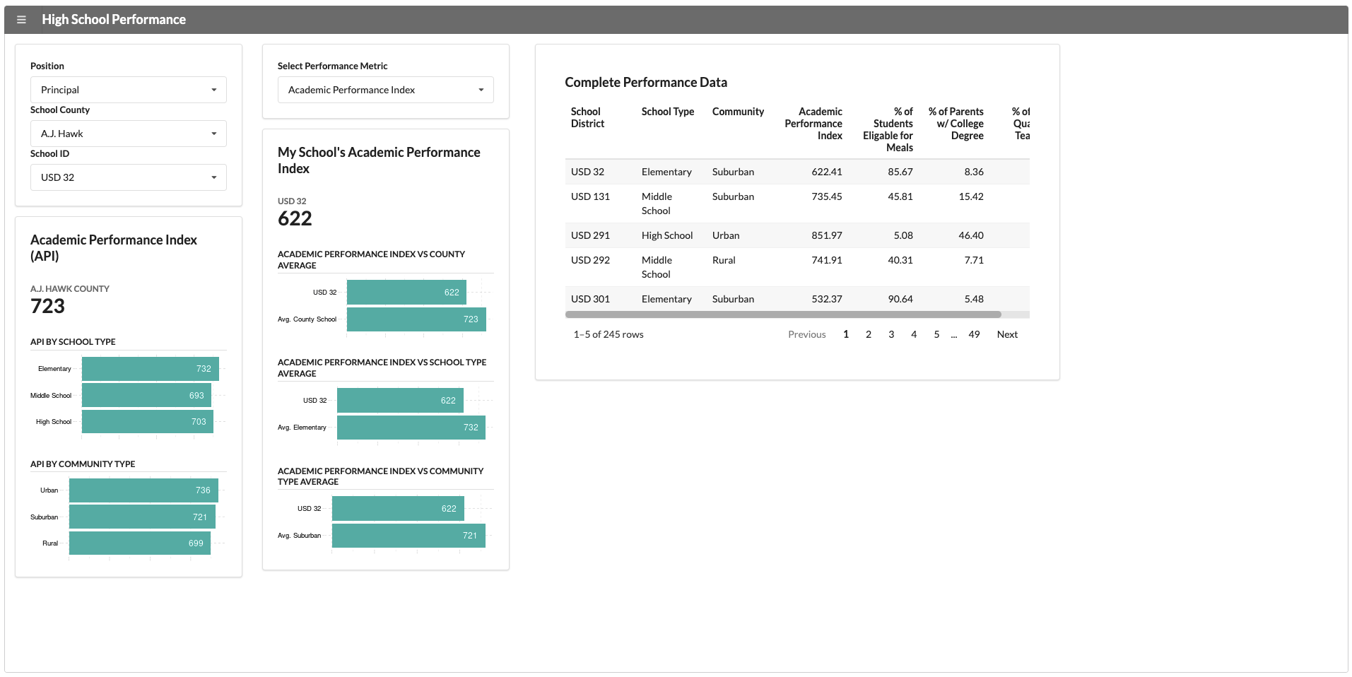
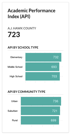
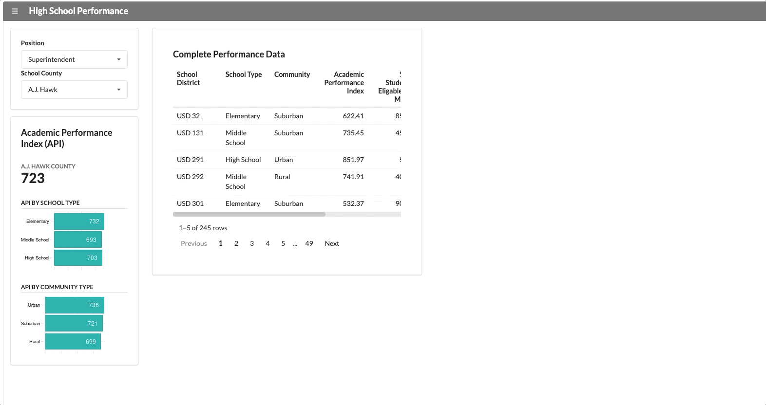
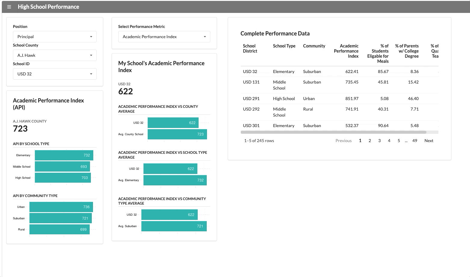
A consistent metric that applies across all counties and schools is “Academic School Performance” (API). This application reports this KPI along with some data visualizations and a simple table, which will show up for every user who opens it.
We have two user groups that use this application: the superintendent of the county and the school principal. The school principal needs to see data specific to their school. If we change the user group from superintendent to principal, a new segment appears with school-specific data.
The functionality above isn’t that innovative though. It’s not hard to hide panels in most dashboard development tools.
But let’s add a more “nuanced” scenario.
It’s not hard to imagine that individual counties face unique problems that other counties do not. Counties with unique problems would likely need to see unique visualizations then, much in the way my former colleague needed for her client.
For example, “Chris Ward County” contains the worst schools, based on academic performance this data set.
Let’s say that the superintendent wants to use this application to nudge performance in a positive direction. And so, he makes a special request to add a data visualizations that highlights the “worst performers” of the county.
This visualization will appear for anyone who selects “Chris Ward” county from the drop-down menu, which is what you see below:
Normally, adding this many nuanced visualizations to a dashboard would start to impact performance, but we can ensure the module only runs when the right criteria is met.
I don’t expect you to understand the code below if you’re new to R programming and R Shiny, but if you pay close attention, you can see the if (<criteria>) and else if (<criteria>) in that dictates this behavior in the app.
If you’d like, you can try play with this app yourself here. In addition to the examples above, we also created a custom visualization shared by both “Chris Spielman” and “Jack Tatum” counties.
I also have the code uploaded to github for any developers interested in playing with it.
Process for Adding Modules to a Shiny App
Development-wise, it’s the same to steps to build a custom visualization in a module as it is to build any application. However, it won’t take nearly as long. The application is already built; we’re simply adding to it.
However, one thing to keep in mind is how to organize your modules.
I suggest creating a special folder called “custom_module” where these modules are stored. You can use the source() function to call them from inside your app.
In screenshot below, you can see the working directory for the application above and then the sub-directory where I place the modules.
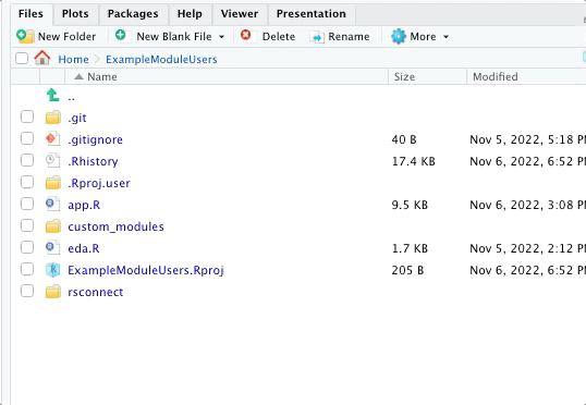
Keeping things organized like this make it much easier to “process-tize” the addition of modules. That improves efficiency and also keeps everything nice and tidy for the next developer. :)
Shiny Modules Can Be Used in Reverse Too!
As you may have noticed, we could use modules in the reverse order. Rather than create a “master dashboard,” we develop a set of data visualizations that are universal to each stakeholder group.
We would then create custom applications for the various stakeholder groups and use the “master modules” with the data visualizations that are universal.
Either approach is valid, depending on which is more efficient in your mind.
This Is Nice, but… Doesn’t It Take Longer to Write a Shiny App?
A criticism I’ve heard about Shiny is that it takes longer to build. That’s not true.
The application you saw above only took me two days to build, which is the same amount of time it would’ve taken me to build in Tableau with a similar data set.
It does take longer to learn R programming though, but that’s okay, because there’s a key benefit that makes it worth the effort - the skills transfer.
The skills an analyst learns building a Shiny app can be re-applied to building a data pipeline or conducting statistical analysis. That reduces the number of tools to integrate and makes the analyst far more cross-functional to an organization.
It’s a lot harder to take the technical skills gained from learning PowerBI (as a random example) and apply it to Alteryx (as another random example).
And as I’ve written about before, a cross-functional team of analysts is another way to escape the “reporting trap” that plagues so many organizations.