install.packages("shiny")
install.packages("bslib")
install.packages("dplyr")
install.packages("ggplot2")
install.packages("tidyr")
install.packages("ggthemes")How to Build a Card in R Shiny
R Shiny
Tutorial
Learn to build a custom card through Bootstrap 5’s style sheet
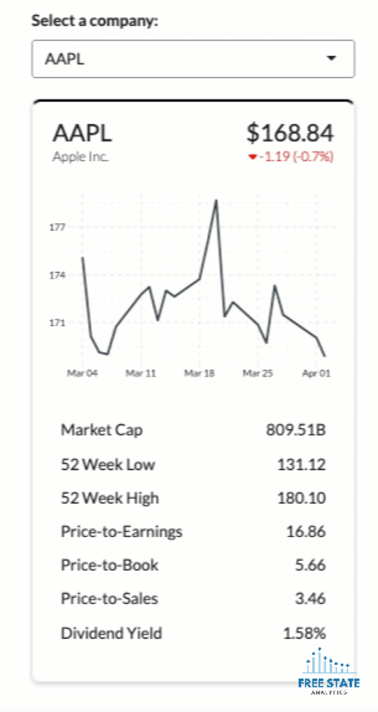
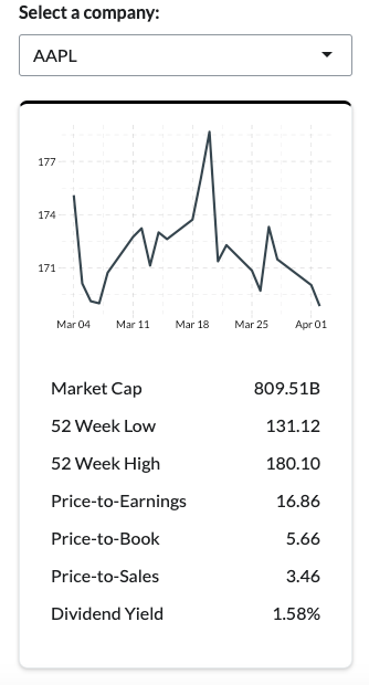
This tutorial teaches you how to build a custom card in R Shiny.
We’ll build the same card you see on the right using stock market data.
This tutorial has another equally important goal. You’ll learn how to:
- Navigate Bootstrap 5’s style sheet
- Use the
divfunction for maximum flexibility
Learning these techniques will help you with more ambitious projects later. You’ll be able to use Bootstrap 5 directly to make UIs that don’t look like other Shiny applications.
Let’s get started!
Why focus on
div and Bootstrap 5?
Shiny applications often look the same.
The reason is most developers use the same standard UI-related functions found in the shiny package.
While these functions are useful for creating a functional application quickly, they don’t allow easy customization.
Fortunately, div, along with its class and style arguments, grant the developer access to a vast number of design options.
This is particularly true with Bootstrap 5, which is the latest iteration of the Bootstrap style sheet that supports Shiny.
Learning to navigate the Bootstrap 5 reference guide makes it easy to apply new designs in Shiny.
Prerequisites
You will need some Shiny experience to follow the tutorial. For example, you should know the difference between a ui and server function, what the input and output parameters do, etc.
This tutorial provides the data. You can download them (plus the tutorial’s complete script) by clicking the button below.
You will also need to ensure the following packages are installed.
Creating the Starter Script
Within the file you just downloaded, create a new app.R file.
Copy and paste the code below into new app.R file.
library(shiny)
library(bslib)
library(dplyr)
library(ggplot2)
library(tidyr)
library(ggthemes)
company_data <- readRDS("./company_data.rds")
historical_prices <- readRDS("./historical_prices.rds")
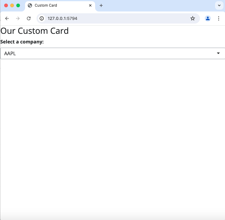
ui <- page(
title = titlePanel("Custom Card"),
h2("Our Custom Card"),
selectInput("filter_company",
label = strong("Select a company:"),
choices = company_data$Symbol,
width = "100%")
)
server <- function(input, output, session) {
}
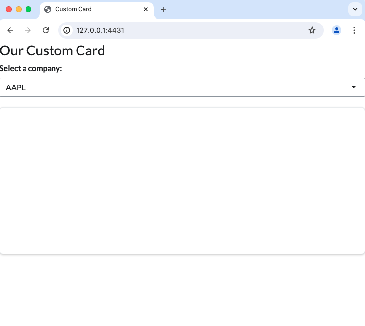
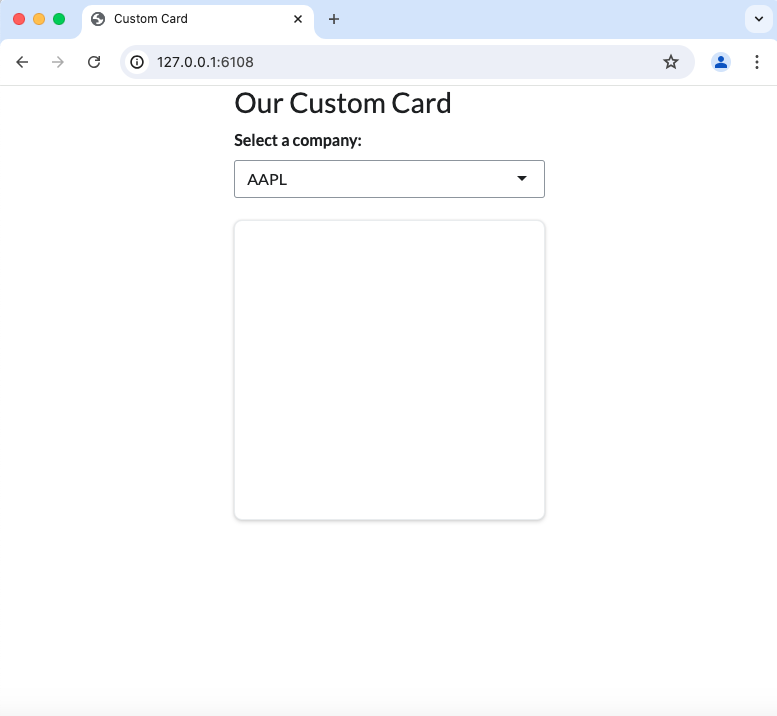
shinyApp(ui, server)Try running the script above.
You should see a rendering similar to the image on the right.
If you do not, something is not working properly.
Ensure that the file paths in your readRDS function are correct and that all packages are properly installed and up-to-date.
Set Theme Version to Bootstrap 5 and Font to “Lato”
Next, let’s ensure that our application uses Bootstrap 5 and change our font to “Lato.”
Regarding Bootstrap 5, it is normally safe assume that loading bslib and using the page in your app.R script will import the latest iteration of Bootstrap, which is version 5.
However, let’s be safe and hard code our Shiny app to use version 5. Otherwise, our future class arguments may not always work as intended.
In the code below, we set theme to bs_theme(version = 5).
ui <- page(
  title = titlePanel("Custom Card"),
  theme = bs_theme(
    version = 5),
  h2("Our Custom Card"),
  selectInput("filter_company",
              label = strong("Select a company:"),
              choices = company_data$Symbol,
              width = "100%")
)
Regarding our font, let’s set it Lato. This isn’t important for the tutorial and you can skip this step, but it’s the font I’ll be using and will impact the screenshots you see throughout the tutorial.
To set the font, we’ll add another argument to bs_theme. We’ll set it to base_font = font_link("Lato", href = "https://fonts.googleapis.com/css2?family=Lato:ital,wght@0,100;0,300;0,400;0,700;0,900;1,100;1,300;1,400;1,700;1,900&display=swap").
Before changing font
After changing the font
Since the href parameter is rather long and distracting, we’ll create font_to_link as an object to pass to the base_font param.
font_to_link = font_link("Lato", href = "https://fonts.googleapis.com/css2?family=Lato:ital,wght@0,100;0,300;0,400;0,700;0,900;1,100;1,300;1,400;1,700;1,900&display=swap")

ui <- page(
  title = titlePanel("Custom Card"),
  theme = bs_theme(
    version = 5,
    base_font = font_to_link
  ),
  h2("Our Custom Card"),
  selectInput("filter_company",
              label = strong("Select a company:"),
              choices = company_data$Symbol,
              width = "100%")
)
Building Our Card
We have a foundational script working. Now let’s build our card.
Fortunately, Bootstrap 5 has several classes of cards we can choose from.
We’ll start with something basic.
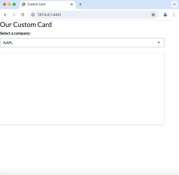
Down below, I add a div function to our ui function with class = "card".
We also set style = "min-height: 300px;". This ensure that we can at least see the card until we start added content.
ui <- page(
  title = titlePanel("Custom Card"),
  theme = bs_theme(
    version = 5,
    base_font = font_to_link
  ),
  h2("Our Custom Card"),
  selectInput("filter_company",
            label = strong("Select a company:"),
            choices = company_data$Symbol,
            width = "100%"),
  div(class = "card",
      style = "min-height: 300px;",
  )
)
The card looks flat though, as you can see on the left image below. A shadow could make it stand out better.
Fortunately, Bootstrap 5 has a class argument to add shadows. You can see the difference with the image on the right. (Note that this can be done to most HTML tags. Not just cards.)
A card without a shadow

A card with a shadow
To use a faint shadow, add shadow-sm to the class argument for our card. Once added, your card should look like the right image above
ui <- page(
  title = titlePanel("Custom Card"),
  theme = bs_theme(
    version = 5,
    base_font = font_to_link
    ),
  h2("Our Custom Card"),
  selectInput("filter_company",
            label = strong("Select a company:"),
            choices = company_data$Symbol,
            width = "100%"),
  div(class = "card shadow-sm",
      style = "min-height: 300px;",
  )
)
What exactly do
class and style do?
Most UI-related functions in R Shiny provide us the option to set class and style arguments. (Those that don’t annoy me greatly.)
style allows us to provide precise CSS instructions to our UI functions to look how we want. We can use the argument to set margins, padding, fonts, colors, widths, alignment, etc.
However, defining style for every HTML tag becomes tedious.
Thankfully, the internet has provided us with an abundant number of templates and frameworks to help us. These are long and well-defined .css files that we can use.
That’s where class comes in handy. class allows us to call upon Bootstrap 5’s .css files.
Add Row and Column to Control Size
Rows and columns are a great way to control the size of your Shiny app’s content. This ensures that content looks good on both mobile and desktop screens.
Fortunately, Bootstrap 5 has several classes that make it easy to dynamically change column sizes based on the browser window size.
As documented here, we can specify how many columns a div should use with the col-{size}- class arguments.
This table below is a reference for how these columns adjust based on window size. (Don’t worry if this table isn’t clear yet. It will after we work through the tutorial below.)
Column Sizes for Bootstrap 5
To get started, we’ll add a div function to our ui. This should encompass all the other tag-related functions (h2, selectInput, and div).
In this new div, we’ll set to col-11.
ui <- page(
  title = titlePanel("Custom Card"),
  theme = bs_theme(
    version = 5,
    base_font = font_to_link
    ),
  div(class = "col-11",
    h2("Our Custom Card"),
    selectInput("filter_company",
              label = strong("Select a company:"),
              choices = company_data$Symbol,
              width = "100%"),
    div(class = "card shadow-sm",
        style = "min-height: 300px;"
    )
  )
)
Now try running your app. Once opened, notice that your card takes up 11/12th of the screen like the image on the right. This will be true regardless of the window size.
However, we don’t want our card to take up most of the window… unless it’s on a mobile phone.
Let’s modify our div to be more responsive.
Add col-sm-7 to the class argument.
Column width set to 11/12th window size
ui <- page(
  title = titlePanel("Custom Card"),
    theme = bs_theme(
      version = 5,
    base_font = font_to_link
    ),
  div(class = "col-11 col-sm-7",
    h2("Our Custom Card"),
    selectInput("filter_company",
              label = strong("Select a company:"),
              choices = company_data$Symbol,
              width = "100%"),
    div(class = "card shadow-sm",
        style = "min-height: 300px;"
    )
  )
)
Now run your app. Play with the size of your browser window. It should look similar to what you see on the right.
Notice how the card takes up 7/12th of the screen until the screen is nearly the size of a mobile?
These column-related classes have a hierarchy.
col-11 dictates the size of a screen starting from the smallest screen.
Once we add col-sm-7, which has a screen size of 567px, our column will take 7/12ths of the screen (until we specify another size above it).
Column setting adjusts based on window size
Once we add col-md-5, our screen will use 5/12s of the screen size once above the “medium” size screen.
We can continue this all the way up until col-xxl-.
Down below, I extended our column-related class arguments to cover all available screen size settings (i.e., class = "col-11 col-sm-7 col-md-5 col-lg-4 col-xl-3 col-xxl-2").
ui <- page(
  title = titlePanel("Custom Card"),
    theme = bs_theme(
      version = 5,
      base_font = font_to_link
    ),
  div(class = "col-11 col-sm-7 col-md-5 col-lg-4 col-xl-3 col-xxl-2",
    h2("Our Custom Card"),
    selectInput("filter_company",
              label = strong("Select a company:"),
              choices = company_data$Symbol,
              width = "100%"),
    div(class = "card shadow-sm",
        style = "min-height: 300px;",
    )
  )
)
Now when you run your app, you’ll see that the card remains roughly the same size as our screen size changes. It should behave similar to what is shown below.
Why not use
column? Or card found in bslib?
Some savvy R Shiny developers might be asking… why are we using div when there are pre-built functions? Why don’t we just use column instead of div? Or card found in bslib?
Pre-built function don’t always anticipate your needs. When using them, you often place restrictions on your own design ambitions. You may spend more time learning how to customize an existing function rather simply using the pieces available.
This detracts from R Shiny’s primary benefit.
R Shiny is a powerful tool because of its access to css libraries, such as Bootstrap, Fomantic-UI, and Microsoft Fluent.
div functions let us use these libraries directly — thus granting us more power to build something new and novel in our Shiny applications.
Center Content
Right now, our card is on the far left side of the screen. It would look better if we center it, much like the image on the right.
We can center the card (or more precisely, its column) using a few class options provided by Bootstrap 5.
Down below, there is a new div function with class = "row justify-content-center".
This places our column in a row and centers it.
Rows can center all columns within it
ui <- page(
  title = titlePanel("Custom Card"),
    theme = bs_theme(
      version = 5,
      base_font = font_to_link
    ),
  div(class = "row justify-content-center",
    div(class = "col-11 col-sm-7 col-md-5 col-lg-4 col-xl-3 col-xxl-2",
      h2("Our Custom Card"),
      selectInput("filter_company",
                  label = strong("Select a company:"),
                  choices = company_data$Symbol,
                  width = "100%"),
      div(class = "card shadow-sm",
          style = "min-height: 300px",
      )
    )
  )
)
Adding Top Border
Right now, our card looks plain. Let’s add something to make it pop a little.
A border would be useful for this purpose.
We could use Bootstrap 5’s predefined border classes. But I think these look too generic, in my humble view.
Fortunately, we can do something custom via style.
Let’s amend our card’s style argument with border-top: solid black.
A card without a top-border
A card with a top-border
ui <- page(
title = titlePanel("Custom Card"),
theme = bs_theme(
version = 5,
base_font = font_to_link
),
div(class = "row justify-content-center",
div(class = "col-11 col-sm-7 col-md-5 col-lg-4 col-xl-3 col-xxl-2",
h2("Our Custom Card"),
selectInput("filter_company",
label = strong("Select a company:"),
choices = company_data$Symbol,
width = "100%"),
div(class = "card shadow-sm",
style = "min-height: 300px; border-top: solid black;",
)
)
)
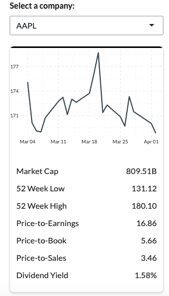
)Add Plot and Table
Our card is blank. We need to add our actual content.
Since this tutorial is primarily focused on the div function and references to Bootstrap 5 classes, I’ll provide ready-made graph and table functions.
Down below, I provide the ui function with plotOutput and tableOutput added.
The server function is provided further below.
ui <- page(
  title = titlePanel("Custom Card"),
  theme = bs_theme(
    version = 5,
    base_font = font_to_link
  ),
  div(class = "row justify-content-center",
      div(class = "col-11 col-sm-7 col-md-5 col-lg-4 col-xl-3 col-xxl-2",
          h2("Our Custom Card"),
          selectInput("filter_company",
                      label = strong("Select a company:"),
                      choices = company_data$Symbol,
                      width = "100%"),
          div(class = "card shadow-sm",
              style = "min-height: 300px; border-top: solid black;",
              div(style = "height: 200px",
                  plotOutput("card_financials_trend")),
              br(),
              tableOutput("card_financials_table")
          )
      )
  )
)
And here is the server function to render the plot and table.
server <- function(input, output, session) {

  output$card_financials_trend <- renderPlot({

    ggplot(historical_prices |>
             filter(Ticker == input$filter_company),
           aes(x = Date,
               y = Close)) +
      geom_line(linewidth = 1.03, color = "#36454F") +
      ggthemes::theme_pander() +
      theme(
        axis.title.y = element_blank(),
        axis.title.x = element_blank())

  }, height = 190)

  output$card_financials_table <- renderTable({

    company_data |> filter(Symbol == input$filter_company) |>
      mutate(across(everything(), as.character)) |>
      transmute(
        "Market Cap" = Market.Cap,
        "52 Week Low" = X52.Week.High,
        "52 Week High" = X52.Week.Low,
        "Price-to-Earnings" = Price.Earnings,
          "Price-to-Book" = Price.Book,
          "Price-to-Sales" = Price.Sales,
          "Dividend Yield" = Dividend.Yield
      ) |>
      pivot_longer(everything())

  }, colnames = FALSE, align = "lr", width = "100%")

}
Use Card Body for Margins and Padding
Right now, our content has no white space between it and the edges of the card.
We could correct this with style arguments such as padding and margin.
However, Bootstrap 5 has another class called card-body that adds this white space with ease.
A card without a “card-body” class
A card with a “card-body” class
To add this padding, we wrap our tableOutput and plotOutput function with a new div function with the class card-body.
ui <- page(
  title = titlePanel("Custom Card"),
  theme = bs_theme(
    version = 5,
    base_font = font_to_link
  ),
  div(class = "row justify-content-center",
      div(class = "col-11 col-sm-7 col-md-5 col-lg-4 col-xl-3 col-xxl-2",
          h2("Our Custom Card"),
          selectInput("filter_company",
                      label = strong("Select a company:"),
                      choices = company_data$Symbol,
                      width = "100%"),
          div(class = "card shadow-sm",
              style = "min-height: 300px; border-top: solid black;",
              div(class = "card-body",
                div(style = "height: 200px",
                    plotOutput("card_financials_trend")),
                br(),
                tableOutput("card_financials_table")
              )
          )
      )
  )
)
Stop! Let’s check our code!
We went through a lot of steps.
It’s easy for a mistake to make it’s way in there.
If you want to play it safe, replace your current app.R file with app_checkpoint.R.
This script contains everything we’ve done so far.
Things will get more complex from here.
Best to make sure you’re ready before proceeding.
Building a Summary Tag List
At the top of the card, we want to show six pieces of information:
- Company’s ticker symbol
- Company’s full name
- Today’s price
- Today’s price change
- Today’s price change direction
- Today’s price change percentage
The card header has six data outputs
This is actually quite a bit of data to summarize in a few inches on the card.
We’ll make heavy use of the div function, columns, and rows to fit it.
Create uiOutput
To make this easy, we’ll actually write our function separate from the ui and server to make the process easier.
To get started, let’s add uiOuptut and renderUI to our app.
Down below, we add uiOutput("card_financials") to our ui function.
ui <- page(
  title = titlePanel("Custom Card"),
  theme = bs_theme(
    version = 5,
    base_font = font_to_link
  ),
  div(class = "row justify-content-center",
      div(class = "col-11 col-sm-7 col-md-5 col-lg-4 col-xl-3 col-xxl-2",
          h2("Our Custom Card"),
          selectInput("filter_company",
                      label = strong("Select a company:"),
                      choices = company_data$Symbol,
                      width = "100%"),
          div(class = "card shadow-sm",
              style = "min-height: 300px; border-top: solid black;",
              div(class = "card-body",
                  uiOutput("card_financials"),
                  br(),
                  div(style = "height: 200px",
                      plotOutput("card_financials_trend")),
                  br(),
                  tableOutput("card_financials_table")
              )
          )
      )
  )
)
And I provide our renderUI script below. This comes with some pre-written data transformation scripts. It should be placed in our server function.
These scripts will eventually be passed along as parameters to our future summary function.
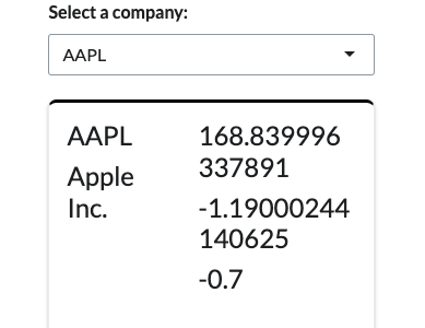
For now, we’ll simply verify that our renderUI function works by returning h2(name_label).
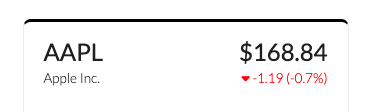
You should see something similar to the image on the right after running.
### This will go in your server function

  output$card_financials <- renderUI({

    name_label <- company_data |>
      filter(Symbol == input$filter_company) |>
      select("Name")
    name_label <- name_label$Name

    price_data <- historical_prices |>
      filter(Ticker == input$filter_company,
             Date == max(historical_prices$Date))

    h2(name_label)

  })
Building Our Summary Function
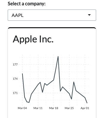
Above the ui and server functions in your app.R script, create a new function called ticker_summary.
We’ll have three parameters: ticker, name_label, and price_data.
We’ll go ahead and return five key data points, which I wrap in div and h4 tags.
ticker_summary <- function(ticker = NULL,
                           name_label = NULL,
                           price_data = NULL) {

  tag_to_return <- div(
    h4(ticker),
    h4(name_label),
    h4(price_data$Adjusted),
    h4(price_data$change),
    h4(price_data$percentage_change)
  )

  return(tag_to_return)

}
With a foundational ticker_summary function now built, let’s modify our renderUI output function found in server to use it.
Down below, I replaced h2(name_label) with our ticket_summary() function.
  output$card_financials <- renderUI({

    name_label <- company_data |>
      filter(Symbol == input$filter_company) |>
      select("Name")
    name_label <- name_label$Name

    price_data <- historical_prices |>
      filter(Ticker == input$filter_company,
             Date == max(historical_prices$Date))

    ticker_summary(
      ticker = input$filter_company,
      price_data = price_data,
      name_label = name_label)

  })
Now go ahead and run your app.
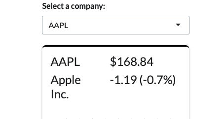
It should look like the image on the right.
Still needs some work, right?
That’s okay. We have the underlying data points. We can refine it into something that looks more professional.
Adding Row and Column
We want the company ticker symbol and its full name on the left of our card and the price data on the right.
Once again, col- is a useful class for dividing this information, provided we wrap it in a row.
Using the code below, we can modify our ticker_summary function to use div function to structure our content accordingly.
Once you run the script, you’ll see how our h4 tags were divided into two columns.
A row and two columns divide our card’s content
ticker_summary <- function(ticker = NULL,
name_label = NULL,
price_data = NULL) {
tag_to_return <- div(
class = "row",
div(class = "col-5",
h4(ticker),
h4(name_label)
),
div(class = "col-7",
h4(price_data$Adjusted),
h4(price_data$change),
h4(price_data$percentage_change)
)
)
return(tag_to_return)
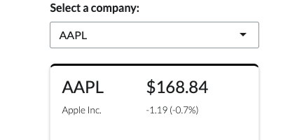
}Format and Round Numbers
Our numerical data points shown on the card need some formatting. It’s hard to tell what is a currency value, what is a percent value, etc.
We can fix this by rounding and adding proper symbols to indicate the units of measurement for our data points.
Formatted and rounded numbers
Below, we use paste0 and round to reduce the number of decimals to two values and to append a “%” and “$” sign to our metrics. (Note: I also placed the change and the percentage_change within the same h4 tag.)
ticker_summary <- function(ticker = NULL,
                           name_label = NULL,
                           price_data = NULL) {

  tag_to_return <- div(
    class = "row",
    div(class = "col-5",
        h4(ticker),
        h4(name_label)
        ),
    div(class = "col-7",
        h4(paste0("$", round(price_data$Adjusted, 2))),
        h4(paste0(round(price_data$change, 2), " (",
                  round(price_data$percentage_change,2) , "%)"))
    )
  )

  return(tag_to_return)

}
Using “Lead” Paragraph Formatting
In Bootstrap 5, there is a class for p called lead.
This is a useful design to pair secondary information with the primary information above it.
For example, the stock ticker symbol is the primary information. It’s a unique identifier that stock brokers use to make a bid. The company name is secondary, because it’s a close second in terms of importance.
Lead class is useful for important information that adds context to bigger data points.
Same with price information. The current price is often considered the most important data point for a stock (value investors would disagree). But today’s price change is a close second and should be paired with the current price.
Let’s change the second line in both columns from h4 to p(class = "lead", ...).
ticker_summary <- function(ticker = NULL,
                           name_label = NULL,
                           price_data = NULL) {

  tag_to_return <- div(
    class = "row",
    div(class = "col-5",
        h4(ticker),
        p(class = "lead",
          name_label)
        ),
    div(class = "col-7",
        h4(paste0("$", round(price_data$Adjusted, 2))),
        p(class = "lead",
          paste0(round(price_data$change, 2), " (",
                 round(price_data$percentage_change,2) , "%)"))
    )
  )

  return(tag_to_return)

}
The lead text is a little too big, in my opinion. It also has too much padding around it, which we’ll revisit shortly.
To shrink the text, let’s adjust the style with font-size: .85em;. In CSS, em work similar to percentage points. So .85em is 85% what the default font size is for our dashboard.
ticker_summary <- function(ticker = NULL,
                           name_label = NULL,
                           price_data = NULL) {

  tag_to_return <- div(
    class = "row",
    div(class = "col-5",
        h4(ticker),
        p(class = "lead",
          style = "font-size: .85em;",
          name_label)
        ),
    div(class = "col-7",
        h4(paste0("$", round(price_data$Adjusted, 2))),
        p(class = "lead",
          style = "font-size: .85em;",
          paste0(round(price_data$change, 2), " (",
                 round(price_data$percentage_change,2) , "%)"))
    )
  )

  return(tag_to_return)

}
Right Align the Right Column
The right handed column in our card’s summary div look funny. We have too much white space between the data point and the edge of the card.
This is because the default for any div is to left align the content.
We can fix this by passing the text-align: right; into our col-7 div.
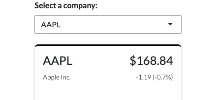
Right-handed column with right alignment makes the card more symmetrical.
The reason you want it in the col-7 div is because a parent tag will pass any style arguments to its child tags.
ticker_summary <- function(ticker = NULL,
                           name_label = NULL,
                           price_data = NULL) {

  tag_to_return <- div(
    class = "row",
    div(class = "col-5",
        h4(ticker),
        p(class = "lead",
          style = "font-size: .85em;",
          name_label)
        ),
    div(class = "col-7",
        style = "text-align: right;",
        h4(paste0("$", round(price_data$Adjusted, 2))),
        p(class = "lead",
          style = "font-size: .85em;",
          paste0(round(price_data$change, 2), " (",
                 round(price_data$percentage_change,2) , "%)"))
    )
  )

  return(tag_to_return)

}
Reduce Padding and Margins
Our current card has some issues with margins and padding. We have no white space on the outer edges of the column, especially compared to our graph and table below.
We also need to reduce white space between our headers and paragraphs within the columns.
Reduced padding consolidates space between primary and secondary labels.
Fortunately, Bootstrap 5’s class arguments make it easy to alter margins and padding without needing to write the more verbose style arguments.
Let’s start by adding some padding to the outer edge of our row. We will add px-1 to our row’s class.
ticker_summary <- function(ticker = NULL,
                           name_label = NULL,
                           price_data = NULL) {

  tag_to_return <- div(
    class = "row px-1",
    div(class = "col-5",
        h4(ticker),
        p(class = "lead",
          style = "font-size: .85em;",
          name_label)
    ),
    div(class = "col-7",
        style = "text-align: right;",
        h4(paste0("$", round(price_data$Adjusted, 2))),
        p(class = "lead",
          style = "font-size: .85em;",
          paste0(round(price_data$change, 2), " (",
                 round(price_data$percentage_change,2) , "%)"))
    )
  )

  return(tag_to_return)

}
Notice that we add an x to px-. This indicates that we want to add padding to the horizontal edges of the tag we’re modifying. We could also use py- to add padding to the vertical edges. Simply using p would add padding to every edge.
We also need to remove the margins from the p and h3 tags. These both default with particular margins. Like the p- class, we can use my-0 to indicate that we want no margins on the vertical edges of the tags.
Note that I add my-0 to four different tags.
ticker_summary <- function(ticker = NULL,
                           name_label = NULL,
                           price_data = NULL) {

  tag_to_return <- div(
    class = "row px-1",
    div(class = "col-5",
        h4(class = "my-0",
           ticker),
        p(class = "lead my-0",
          style = "font-size: .85em;",
          name_label)
    ),
    div(class = "col-7",
        style = "text-align: right;",
        h4(class = "my-0",
           paste0("$", round(price_data$Adjusted, 2))),
        p(class = "lead my-0",
          style = "font-size: .85em;",
          paste0(round(price_data$change, 2), " (",
                 round(price_data$percentage_change,2) , "%)"))
    )
  )

  return(tag_to_return)

}
Using Color for Price Change Direction
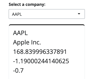
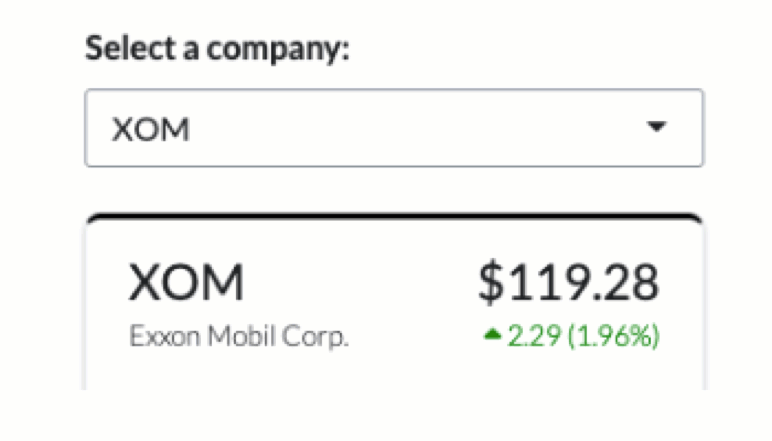
Most stock market websites show the price change in green when the price goes up and red when it goes down.
We can do this too, although we have to be clever about it since we want to pass the color via a style argument.
I found it easier to simply create a new object that is generated with an ifelse(...) function.
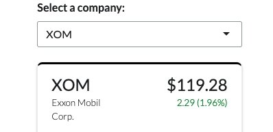
Color is a great way to signal positive and negative outcomes.
Within the ticker_summary function, we’ll define the color based on the price change direction and then pass that via the style argument for the p that contains the price change data.
Note that we have to use paste0 to combine the color argument with other style arguments.
ticker_summary <- function(ticker = NULL,
name_label = NULL,
price_data = NULL) {
change_color <- ifelse(price_data$change < 0, "red",
ifelse(price_data$change == 0, "black",
"green"))
tag_to_return <- div(
class = "row px-1",
div(class = "col-5",
h4(class = "my-0",
ticker),
p(class = "lead my-0",
style = "font-size: .85em;",
name_label)
),
div(class = "col-7",
style = "text-align: right;",
h4(class = "my-0",
paste0("$", round(price_data$Adjusted, 2))),
p(class = "lead my-0",
style = paste0("font-size: .85em; color:", change_color),
paste0(round(price_data$change, 2), " (",
round(price_data$percentage_change,2) , "%)"))
)
)
return(tag_to_return)
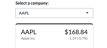
}Adding Icons
Showing red or green is a good way to indicate good and bad changes.
But for colorblind people like me, it’s hard for me to notice the red text is, well… red. It often just looks the same as black text.
Icons are a good way to accommodate this disability in design.
And lucky for us, Shiny incorporates free font awesome icons that we can use.
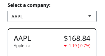
Adding an icon helps provide a second signal on directional change. This is useful for colorblind users.
We can use the icon(...) function. We can pass caret-down or caret-up as the type of icon we wan to see. Much like we did with the color, it’s easier to define the icon we want at the start of our ticker_summary function and then call the argument via icon(...) inside our div.
ticker_summary <- function(ticker = NULL,
                           name_label = NULL,
                           price_data = NULL) {

  change_color <- ifelse(price_data$change < 0,  "red",
                       ifelse(price_data$change == 0, "black",
                       "green"))

  change_symbol <- ifelse(price_data$change < 0, "caret-down",
                          ifelse(price_data$change == 0, "",
                                 "caret-up"))

  tag_to_return <- div(
    class = "row px-1",
    div(class = "col-5",
        h4(class = "my-0",
           ticker),
        p(class = "lead my-0",
          style = "font-size: .85em;",
          name_label)
    ),
    div(class = "col-7",
        style = "text-align: right;",
        h4(class = "my-0",
           paste0("$", round(price_data$Adjusted, 2))),
        p(class = "lead my-0",
          style = paste0("font-size: .85em; color:", change_color),
          icon(change_symbol),
          paste0(round(price_data$change, 2), " (",
                 round(price_data$percentage_change,2) , "%)"))
    )
  )

  return(tag_to_return)

}
Adding “No Wrap”
If you change the drop down filter to a different company, you’ll notice that our company name sometimes inserts a line break.
This is okay depending on your preference, but it’s an easy fix if you always want to ensure that it doesn’t wrap.
To prevent wrapping, simply add white-space: nowrap; to your style argument for the lead paragraph.
A comparison of wrapped text with “nowrap”.
ticker_summary <- function(ticker = NULL,
                           name_label = NULL,
                           price_data = NULL) {

  change_color <- ifelse(price_data$change < 0,  "red",
                       ifelse(price_data$change == 0, "black",
                       "green"))

  change_symbol <- ifelse(price_data$change < 0, "caret-down",
                          ifelse(price_data$change == 0, "",
                                 "caret-up"))

  tag_to_return <- div(
    class = "row px-1",
    div(class = "col-5",
        h4(class = "my-0",
           ticker),
        p(class = "lead my-0",
          style = "font-size: .85em; white-space: nowrap;",
          name_label)
    ),
    div(class = "col-7",
        style = "text-align: right;",
        h4(class = "my-0",
           paste0("$", round(price_data$Adjusted, 2))),
        p(class = "lead my-0",
          style = paste0("font-size: .85em; color:", change_color),
          icon(change_symbol),
          paste0(round(price_data$change, 2), " (",
                 round(price_data$percentage_change,2) , "%)"))
    )
  )

  return(tag_to_return)

}
Conclusion
Congratulations! You built your own custom card.
And better yet — you (hopefully) have a better understanding of how Bootstrap 5 works and how to navigate its documentation.
If you enjoyed this tutorial, please follow us on LinkedIn for future content.
Feel free to contact us for R Shiny, Quarto, or Posit Product consulting more broadly.